“Breaking down barriers so everyone has a seat at the table.”
Services
Inspired by the idea that accessibility is infrastructure worth raising a glass to, Cheers to Access is built on a reframe. The brand is an accessibility consulting and training practice for mid-size organizations, created to move teams from compliance anxiety to confident, lasting inclusion. Its primary tagline, Shaking Up the Status Quo, sets the register: aspirational, a little cheeky, and unwilling to treat inclusion as a burden to be managed. The bridge sits at the center of everything the brand says, connecting legal obligation to human opportunity and awareness to action.
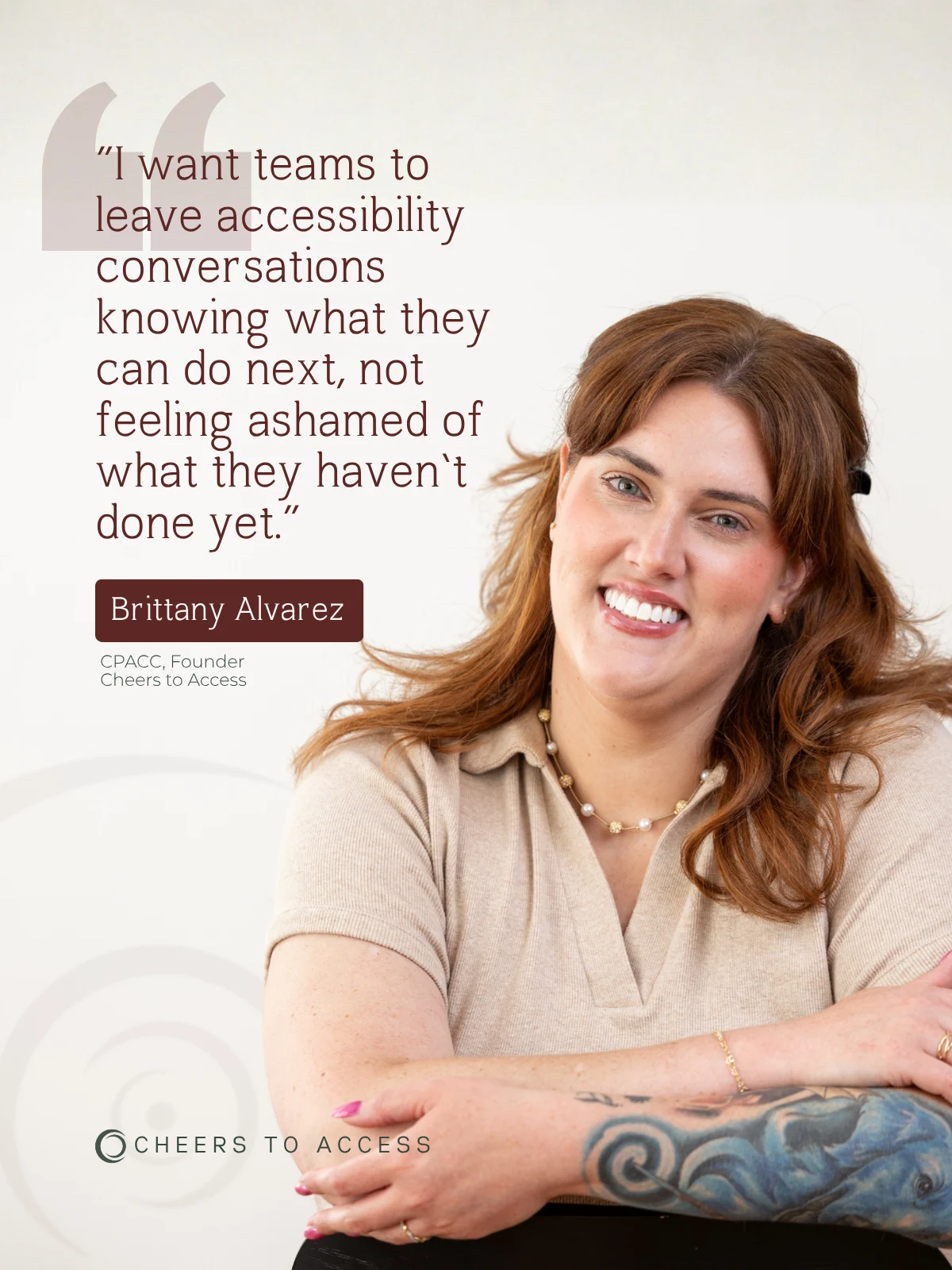
The best part about working with Moxie Creative Studios is that they want your brand to be authentic to you, so they put a lot of time and effort into listening to you and you can feel that.
Founder, Cheers to Access
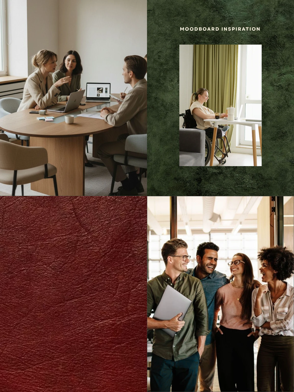
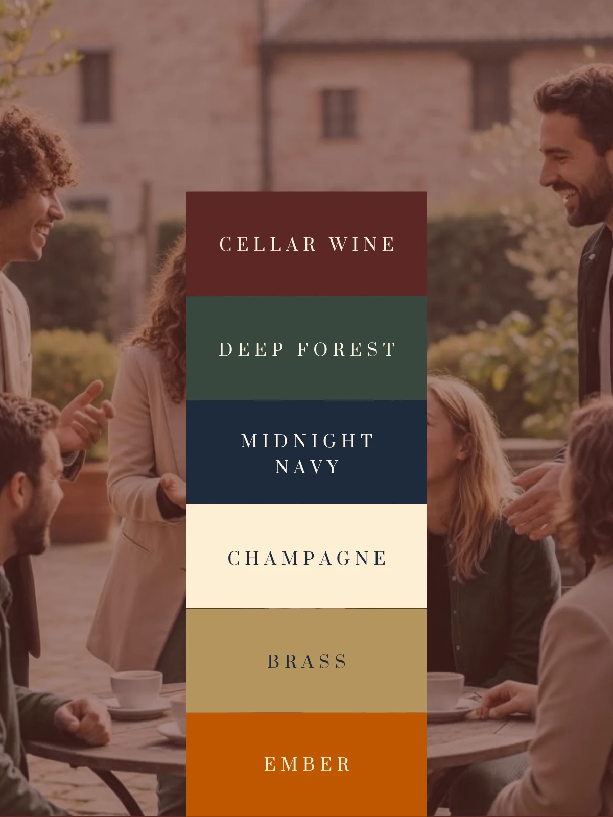
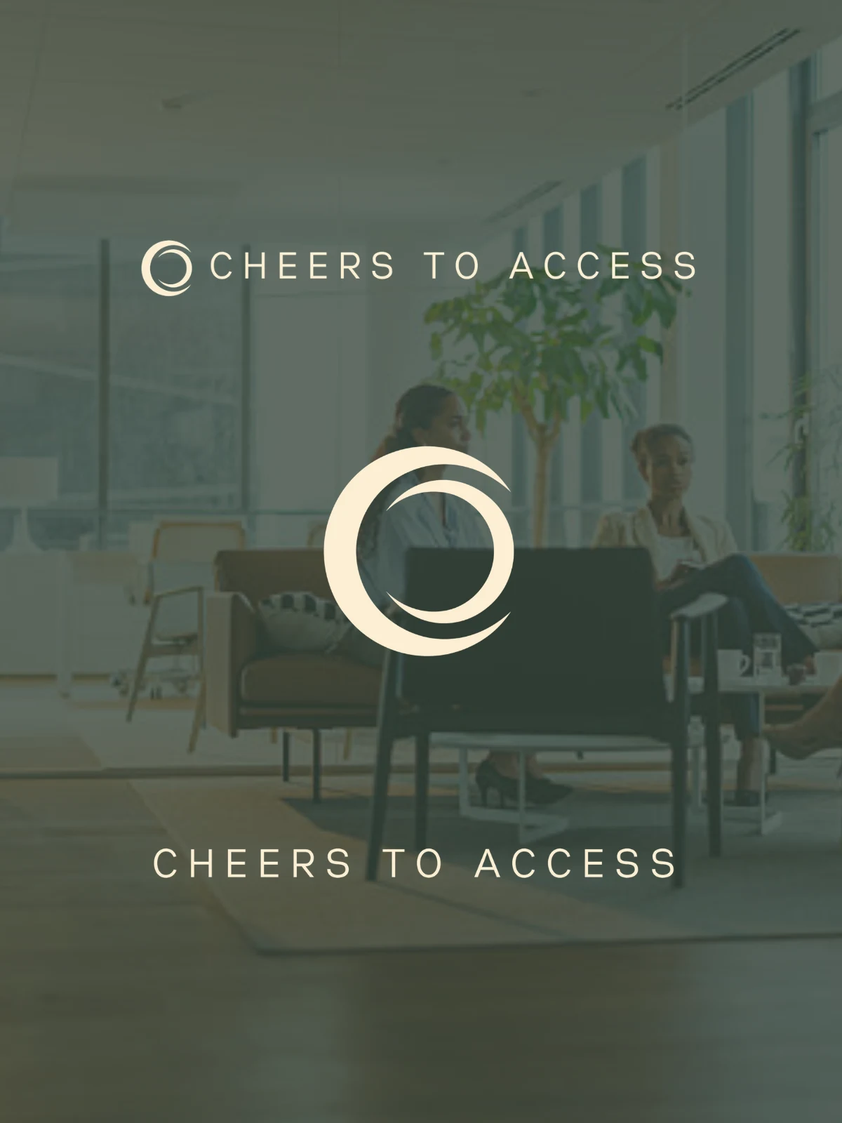
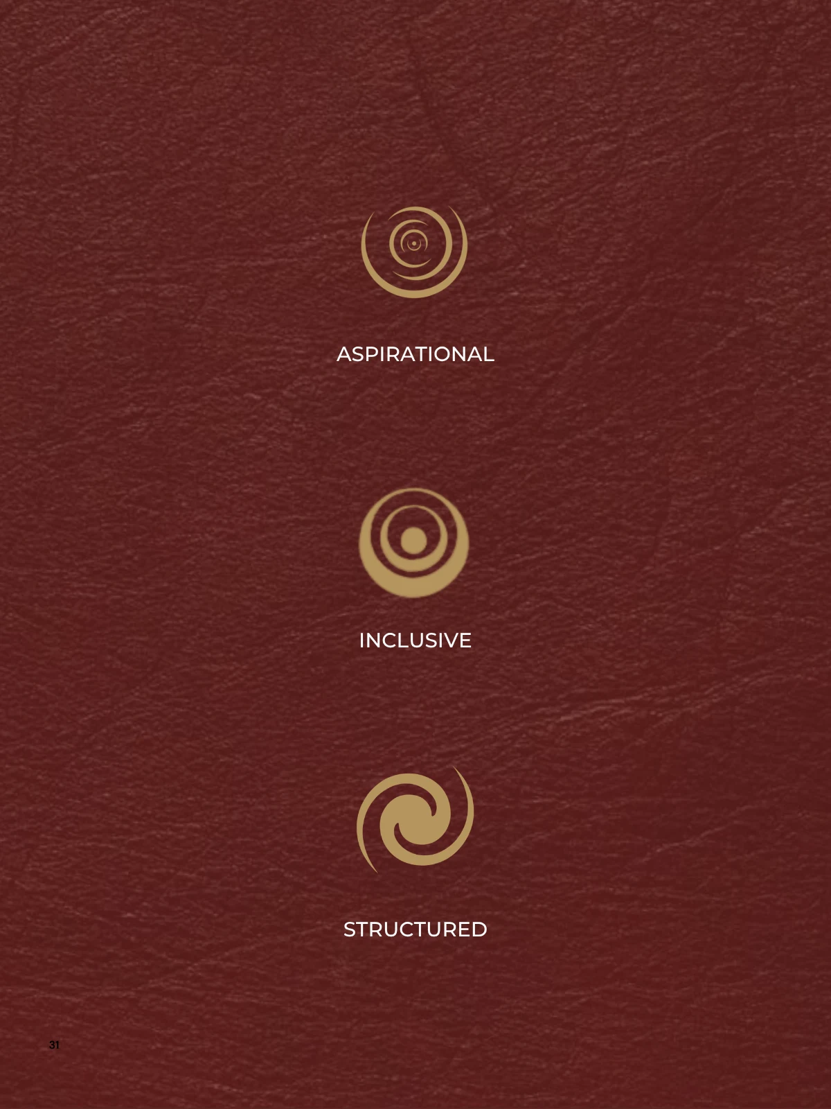
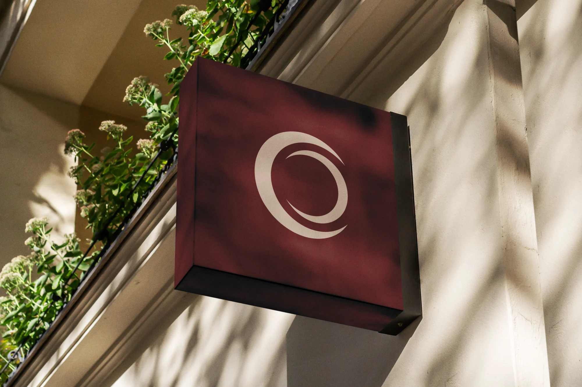
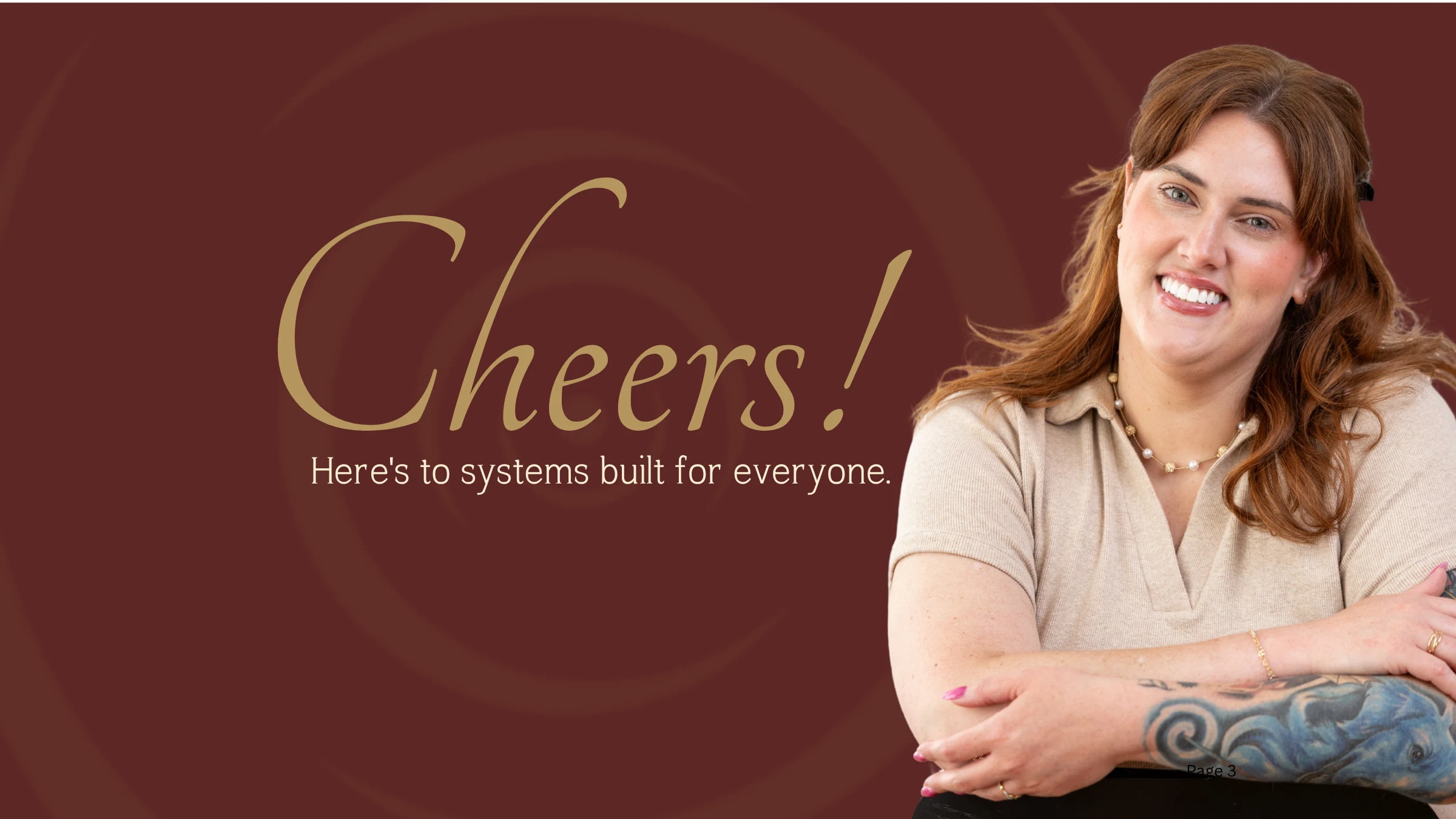
The identity carries that same energy. It is aspirational, inclusive, and structured, holding celebration and rigor in the same frame. A deep, saturated palette of Cellar Wine, Deep Forest, and Midnight Navy grounds the brand with authority, warmed by Champagne, Brass, and Ember. Wide-tracked typography keeps the tone confident and unhurried, and the circular mark reads as a glass, a bridge, and a gap closing into a whole. Photography leads with people at work together, which is where the brand's promise actually lives.
As the standard-bearer for what it teaches, the brand had to model it. Accessibility shaped the system from the start, with high contrast, generous type, and descriptive alt text built into every asset. The result is a brand that can hold a boardroom conversation and a celebration in the same breath, elevated and warm and credible enough to make the case on both the business and the human side.
Selected Work